BRANCH BASICS
At Branch Basics, I led the design direction for Pure Perks—a loyalty experience built to reward customers for living clean and consciously. Working closely with the marketing team, I crafted a visual and UI system that translated the brand’s values into an intuitive, human-centered digital experience.
Rooted in Branch Basics’ mission of healthy homes and healthy humans, the program blends clarity with warmth, making loyalty feel effortless rather than transactional. From brand identity to interface design, every touchpoint was shaped to feel cohesive, elevated, and distinctly Branch Basics, strengthening engagement while reinforcing the brand’s purpose.
ROLE:
2021-2023 // SENIOR DIGITAL DESIGNER AT BRANCH BASICS
DELIVERABLES:
BRANDING
ECOMMERCE LOYALTY SYSTEM
TOOLS:
FIGMA
ADOBE ILLUSTRATOR
ADOBE PHOTOSHOP
CLIENT:
BRANCH BASICS
YEAR: 2023 - 2025

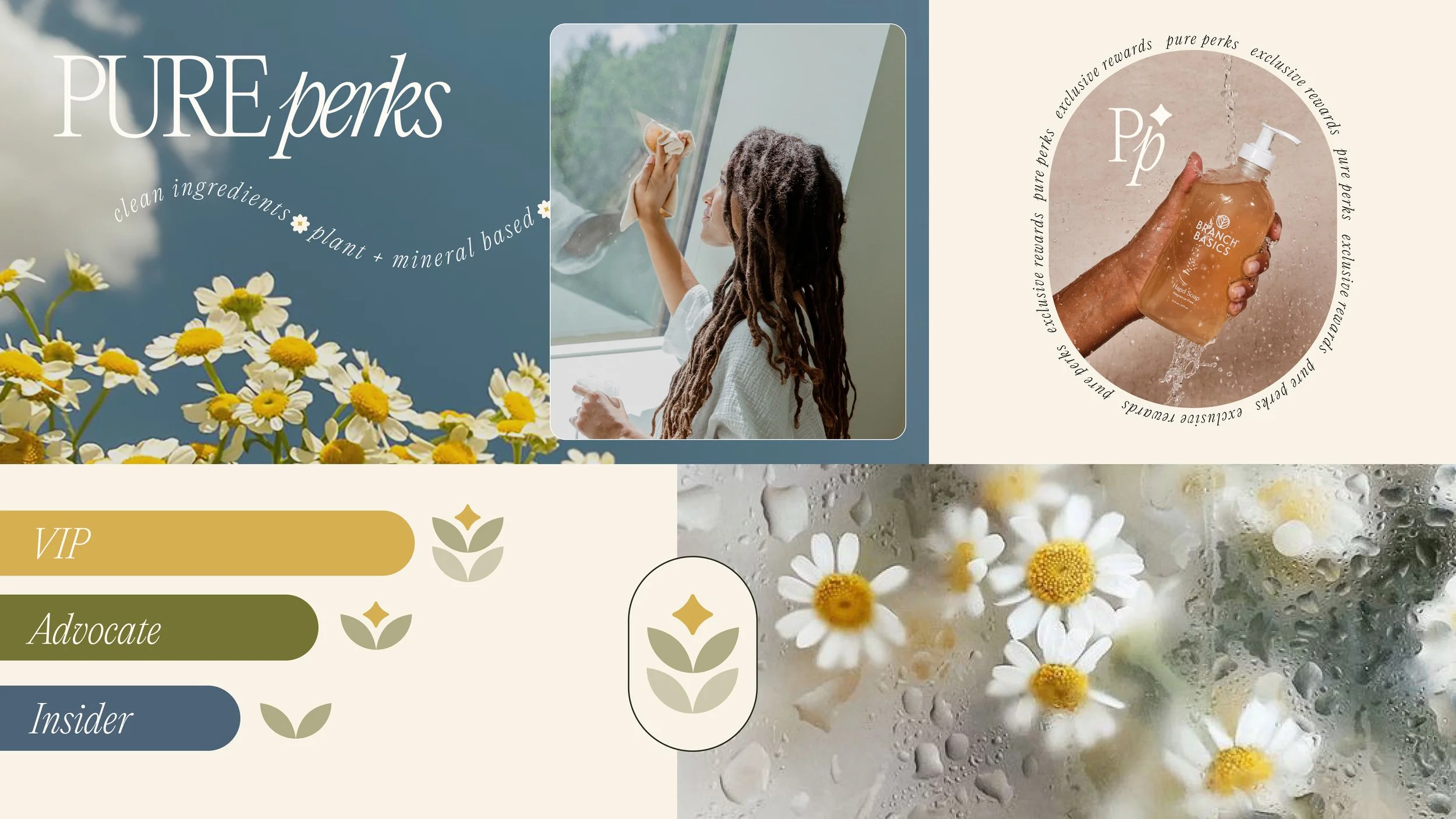
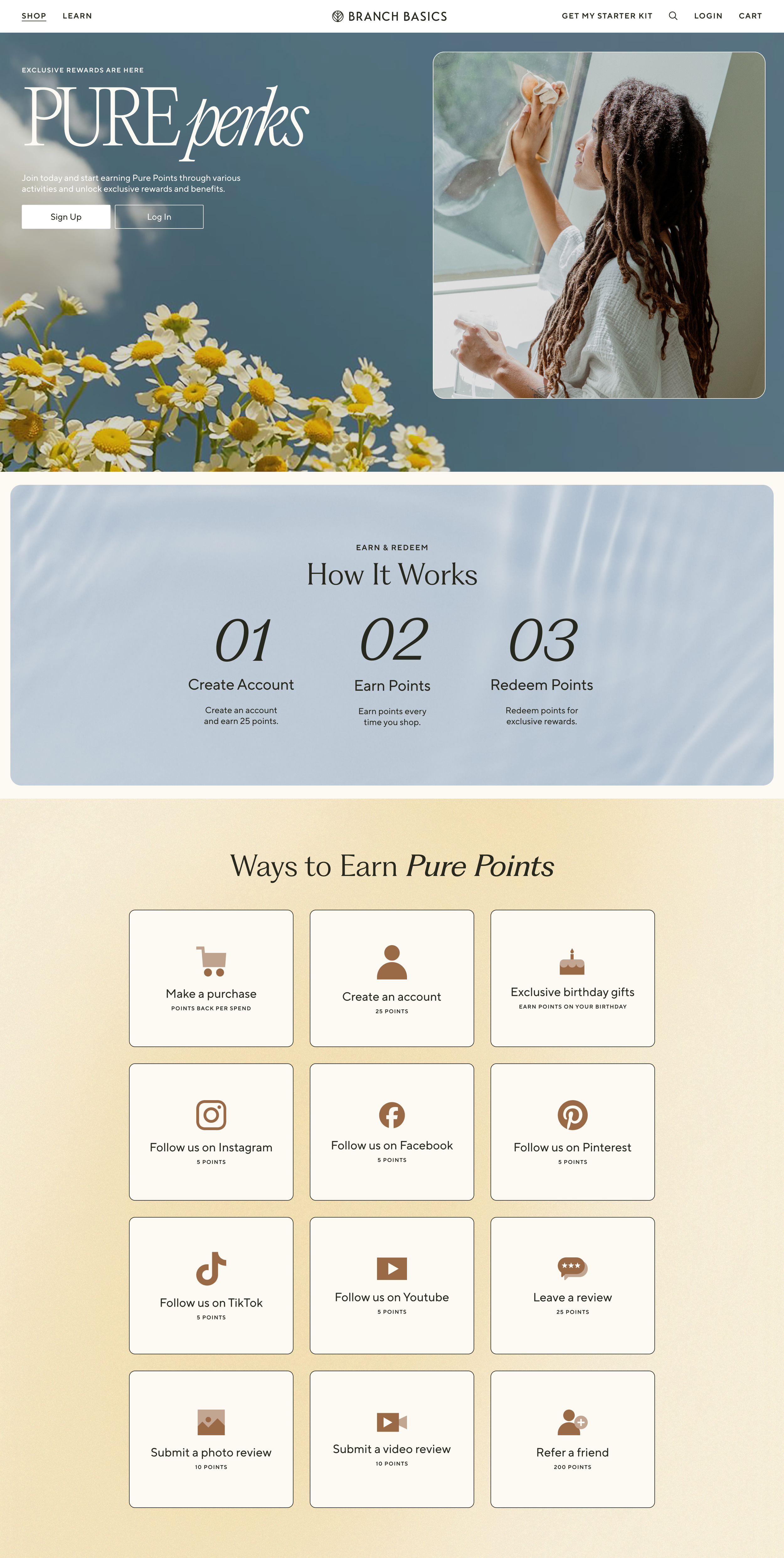
BRAND & CONCEPT
Pure Perks needed to feel distinct while still living naturally inside the Branch Basics ecosystem. I designed a visual identity that honored the ingredients behind the products—drawing inspiration from chamomile and the brand’s signature golden concentrate.
The system leans into organic elements and soft textures: water, light, botanicals—while maintaining an elevated, premium tone. The goal was to create a space that felt like its own world, yet unmistakably Branch: calm, clean, and rooted in intention.
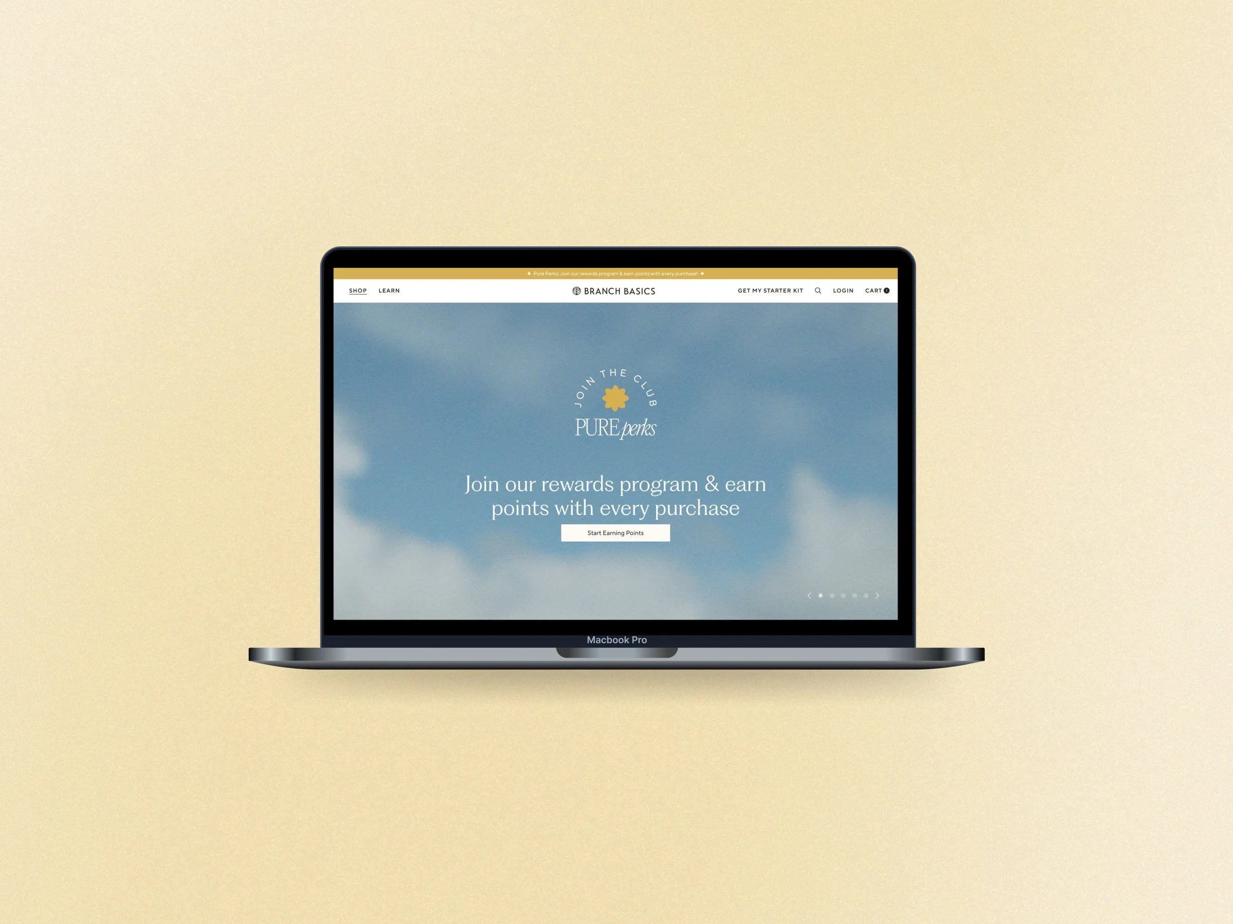
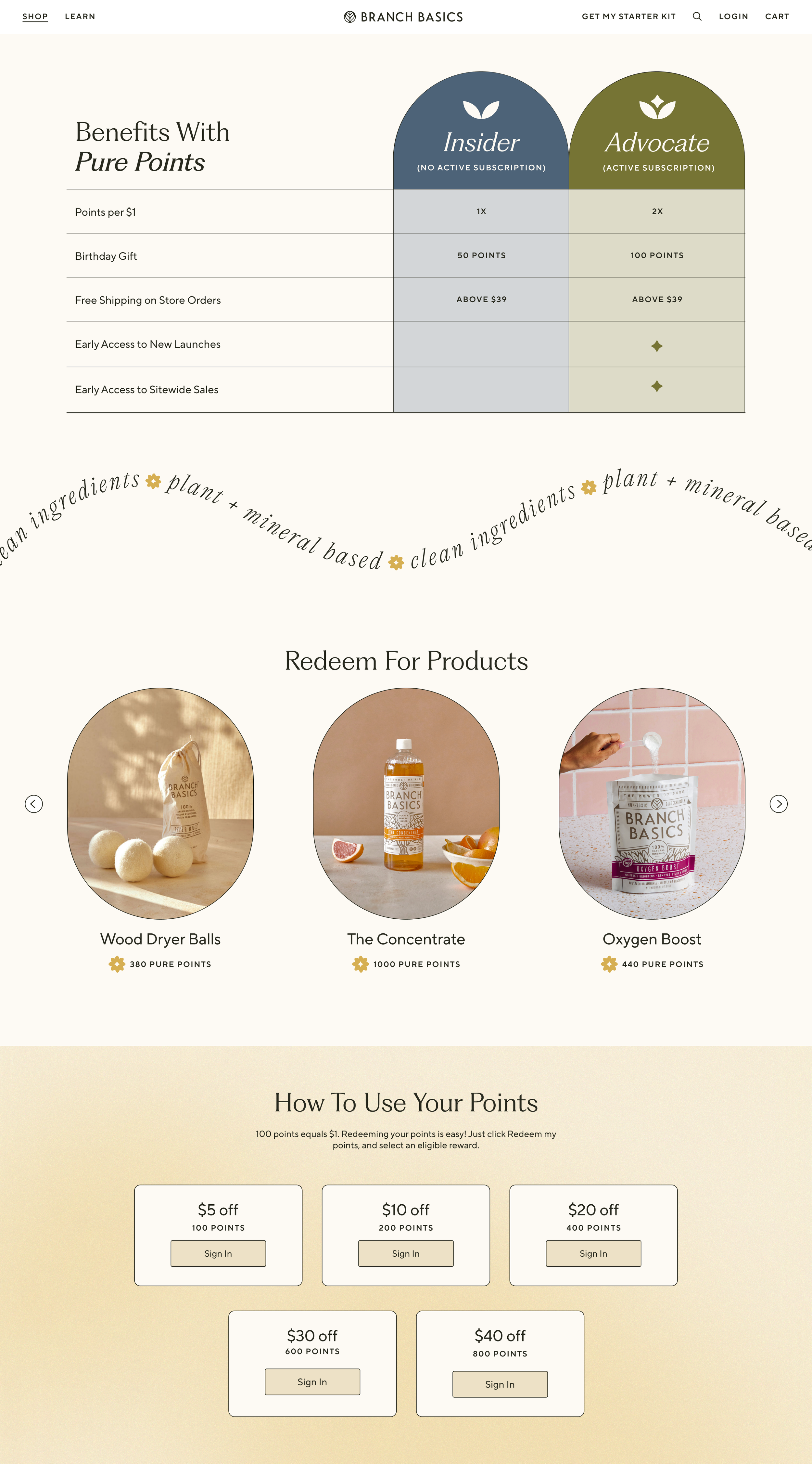
THE EXPERIENCE
The Pure Perks website was designed to educate and convert in seconds.
Built within Yotpo’s loyalty framework, Pure Perks had to live inside a shared system many brands use. Rather than accept a templated look, I treated those constraints as a creative challenge, pushing the design as far as possible through layout, hierarchy, and brand-led details.
The result is a loyalty experience that feels elevated, intuitive, and distinctly Branch Basics.
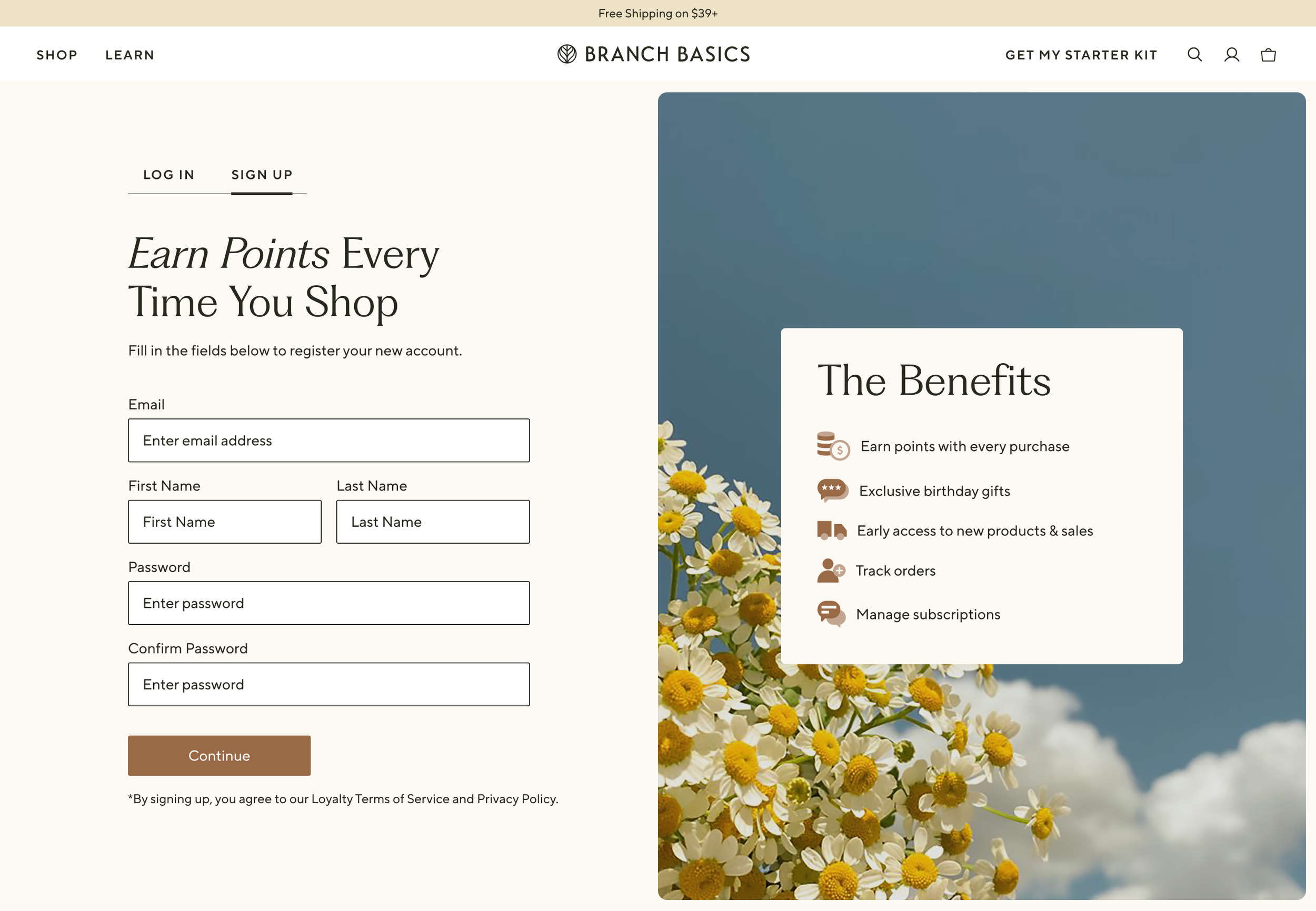
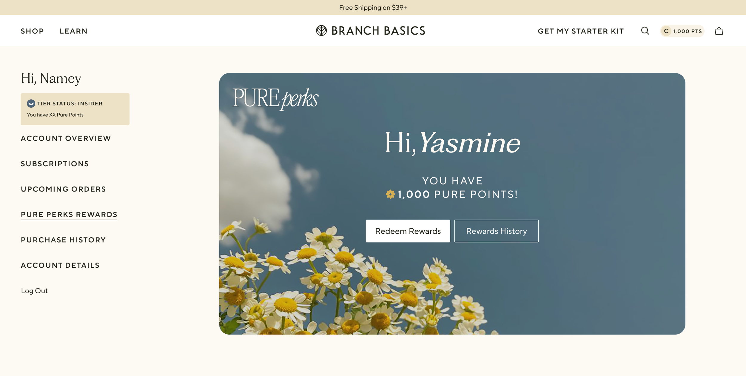
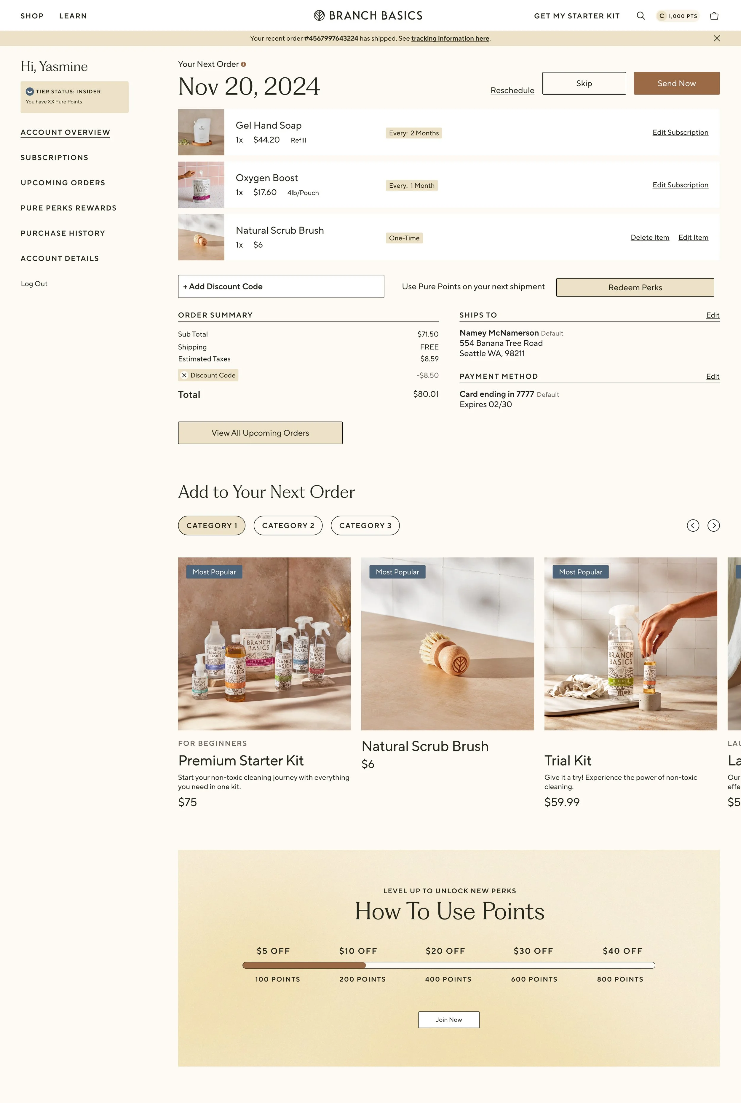
ACCOUNT & RETENTION
After launch, the focus shifted to retention—bringing Pure Perks into the account experience in a way that felt motivating and effortless.
I designed the dashboard to make status, points, and progress instantly clear, using tier icons and hierarchy to show users where they are and what’s next at a glance.
By extending familiar account and checkout patterns, everyday moments became opportunities to reinforce value and encourage action, turning routine visits into small wins that keep customers engaged.
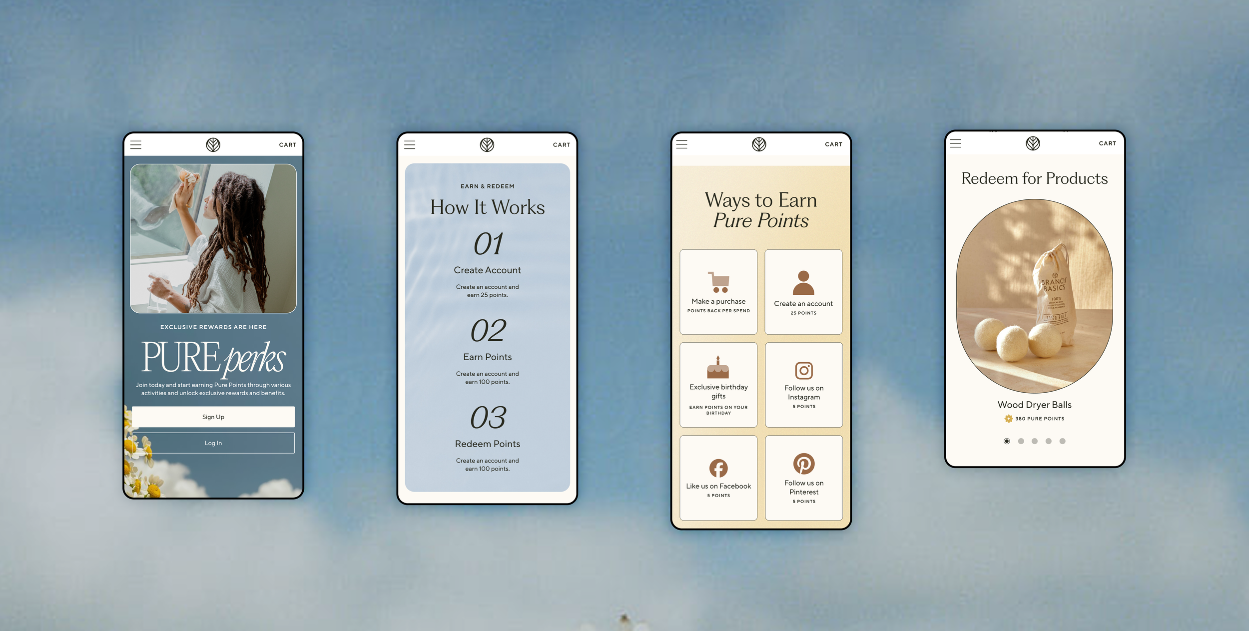
MOBILE-FIRST THINKING
With the majority of traffic coming from mobile, every screen was designed to translate complex UX patterns clearly on small devices.
The loyalty badge was treated as a product signal, not decoration, appearing at key moments like PDP and Cart to surface value at decision points and reinforce the reward behind each action.

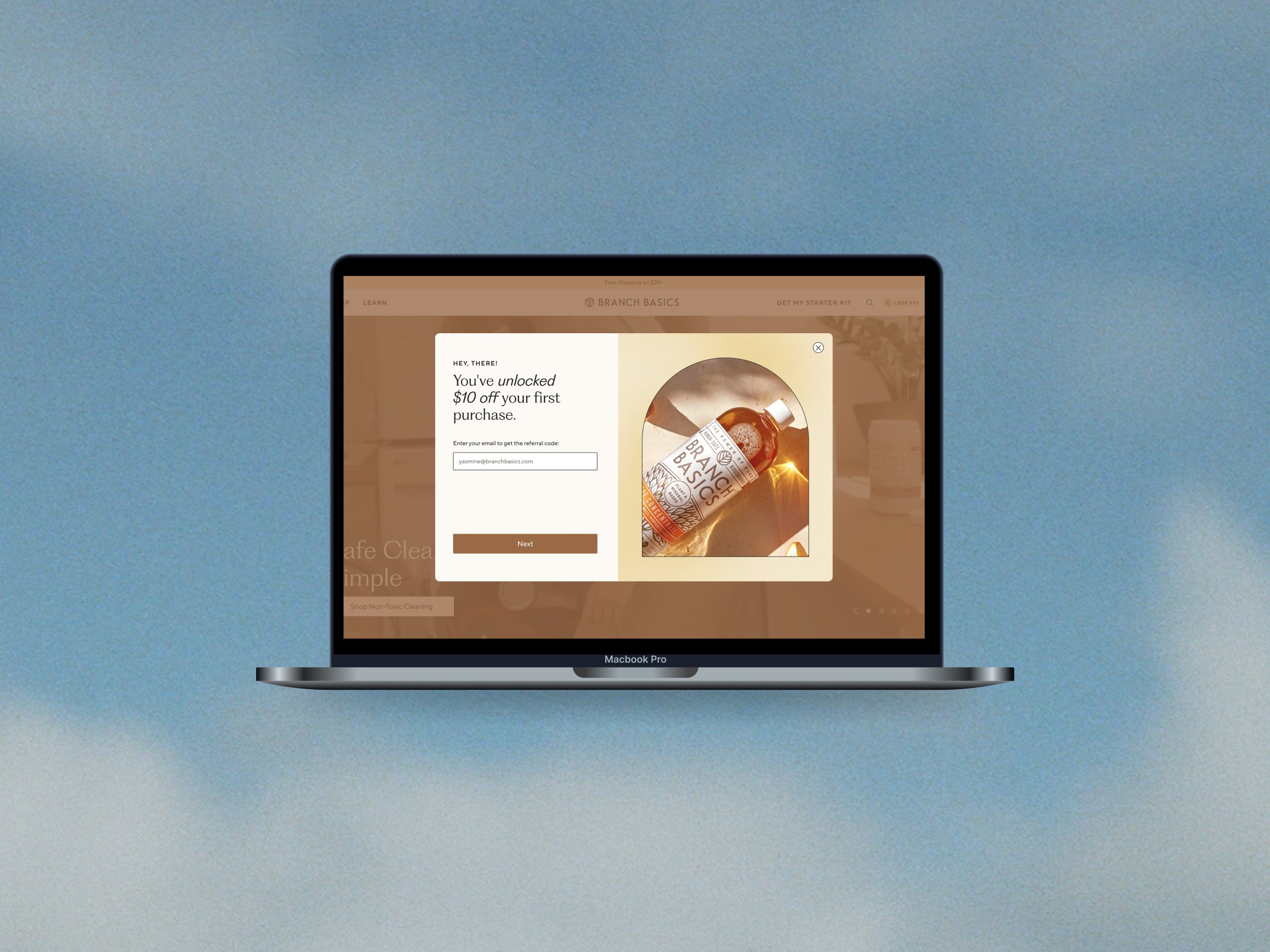
LIFECYCLE MOMENTS
Beyond core pages, I focused on the moments in between. Pop-ups, sign-up flows, and entry points into the program were designed to feel like a natural extension of the Pure Perks world—never generic or transactional.
By carrying the visual language, iconography, and tone into these touchpoints, each interaction reinforces the value of joining and makes the transition from browsing to belonging feel seamless.
The result is a loyalty experience that feels cohesive from first touch to long-term engagement.